We have discussed in previous posts reliance on data and how technology and the instant access to information has been transformative in society. Technology and quick access to data continues to expand as does reliance on it. With such a deluge of various sources, both in terms of raw numbers and “processed” or interpreted information, and on a virtually unlimited number of topics, it is sometimes difficult to derive meaning.
Below we provide some keys for helping understand and interpret data.
These are by no means all inclusive but provide some basic guidance and considerations that will assist in interpretation. To help illustrate, we examine data from the COVID pandemic. Our goal here is not to provide medical information or opinion but simply use the data to highlight keys to interpretation. For simplicity, we further assume the data sources are accurate as reported.
One overarching principle in approaching data analysis is to take a holistic view.
As humans, we have a tendency to compartmentalize things. We like to categorize them; put them in boxes, and do our analysis of each independently.
It is natural to want to arrange and simplify facts. This facilitates understanding as well ease of communicating information. This is valid, and one researcher described science as the art of continual simplification. Statistical models that we build, for example, are merely simplified versions of reality. They enhance our ability to study and understand which, of course, is quite useful.
It is important to realize, however, that such simplification only becomes advantageous once the field of study has been narrowed. Once a specific area of focus has been determined, simplification becomes a tool of analysis. Prior to this, however, and in a broader sense, this can actually hinder and distort accurate interpretation.
Below we examine COVID-19 statistics. We focus on a single state, Mississippi, and these data are current as of this writing regarding the COVID-19 pandemic. The data includes the number of cases, hospitalizations, and deaths as reported stemming from COVID-19.
1) Examining Trend
One of the primary bits of information most people may be interested in, in regard to the pandemic, is the direction things are heading.
From the data, we have 3 different points we could examine: (1) total cases, (2) hospitalizations, and (3) deaths.
If we were interested in primarily the spread of the virus, we would examine total cases. We would be interested in the change in the occurrence of cases. But how do we examine this change: do we look at net or relative change? In other words, are we interested in the change as a percentage or on a numerical basis?
The answer here is that we would need to look at both. We may look at a percentage change, and it may show 100% rate of growth. However, if the 100% was a change from 2 to 4 cases, it would not be very meaningful. Conversely, the net change may show an increase of 50 cases; but if there were thousands of cases being reported, that would not be meaningful either.
To have the full picture and be able to interpret the data, both would need to be examined.
In some cases, both relative and net change are equally meaningful.
An example is the change in COVID cases in Mississippi as shown below. As of April 4, 2020, there were a total of 1,637 cases reported. One month later in May, there were a total of 8,205 cases. In July, two months later, there were 30,666 cases. Both the relative change and the net change are important.
In addition to merely providing information about trends, observing data over time can be a powerful tool. It can help strengthen analysis by observing multiple snapshots of a population at different intervals as opposed to static data that represents only one time period. It can also yield additional insights in what is accounting for underlying trends.
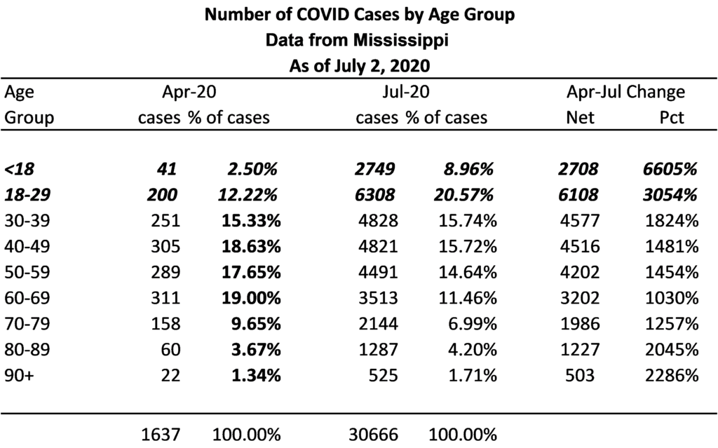
As an example, consider the age distribution of the Mississippi data, below.
As shown, the largest growth in total cases has been in the < 18 and the 18 – 29 age groups. In addition to having the highest percentage change in total cases in these groups, as a percent of all cases, these groups as a percent of total cases have changed significantly.
In April, these two age groups (<18 and 18 – 29) comprised less than 15% of all cases. As of July, these two age groups comprised nearly 30% of all cases. There was very little change in the other groups, with the exception of the 60 – 69 age group, which declined from 19% of all cases to 11.46% of all cases.
In particular, note that the < 18 age group had by far the greatest increase in cases on a percentage basis. Schools were out for the last part of the school year, but summer school activities and sports resumed in May. Whatever the reason, it could be a harbinger of what to expect when schools reopen in the Fall.
2) Frame of Reference or Context
As shown above, the number of cases increased from roughly 1,600 to over 30,000 in three months. This is a 1,773% change, which seems pretty significant. However, one other piece of information to consider in these figures is the population. Over 30,000 cases seem significant, but how does that relate to the population?
The estimated population in Mississippi is about 3 million, 2,988,762. Based on this, although the numbers seem large, cases thus far have occurred in only roughly 1% of the population.
Digging a little deeper, we can also evaluate deaths attributed to COVID in the state. As of July 2, 2020, there were 1,107 deaths reported due to the virus. Again, relative to the population, this represents less than 1/10 of one percent, 0.037% of the state’s population.
3) Consider Important Qualifiers
As suggested at the beginning of this post, a holistic approach to data can provide better interpretative understanding. Above we considered deaths relative to the population. Another important data point is the deaths relative to diagnosed cases.
Of the 30,666 cases reported, there have been 1,107 deaths which constitute a rate of 3.6% of total cases. However, in examining the data more closely, roughly one-half (537) of the deaths occurred in long term care facilities.
If these data were adjusted to exclude long term care facilities, the death rate among the general population is 1.86%. In addition, if we remove the cases in long term care facilities from the overall cases, it puts the incidence of COVID diagnosis at less than 1% of the general population.
4) Importance of a Comparator
Summarizing where we are at this point, we have seen where net and relative change is important, adding a frame of reference like population provides yet another dimension and clarity, and qualifiers can play a role in the conclusions we draw from data. We can go one step further in this regard and compare these numbers to other similar situations to provide even more context.
As an example, let’s consider nationwide data from the last 3 flu seasons, and the most recent pandemic, H1N1, or Swine Flu. The table below shows cases, hospitalizations and deaths.
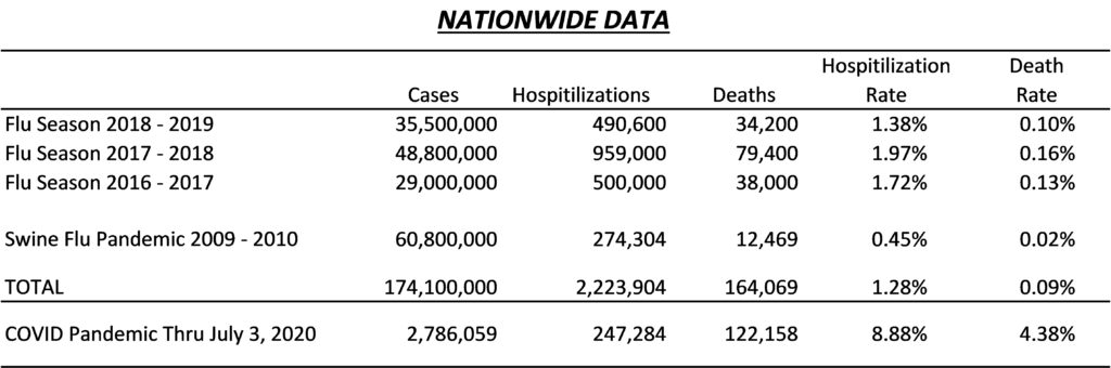
The first thing we notice from the table is the H1N1 pandemic appears to be an outlier compared to the last 3 flu seasons in terms of both hospitalization and deaths. There were a large number of cases with H1N1, but the data show extremely low death and hospitalizations relative to the more recent 3 flu seasons.
We could speculate as to why that is the case, such as reporting differences or actual differences in the virus. In either case, when considering comparators, we often have to deal with outliers. One approach would be to ignore it, and only look at the other flu season; another would be to take an average of all 4; and yet another approach would be to use the median.
In examining the table, we can see that regardless of the approach, the COVID virus has higher rates of both hospitalizations and deaths from all 4 comparators.
The hospitalization rate of COVID is 8.88% compared to the highest rate of the comparative (2017-2018 flu season) of 1.97%. The death rate as a percent of total cases is 4.38% compared to the highest comparator, also the 2017-2018 flu season, 0.16%
5) Consideration of Key Factors
Related to context, described above, there also may be relevant factors that yield critical information. Relating to the MS data, there are other factors reported that provide some important insights.
The first thing is in regard to understanding the actual number of active cases. The data examined thus far report total cases. We noted above that the rate of diagnosed cases at this point is roughly 1% of the total population. The MS data further includes a number of presumed recovered cases, which is defined as those in which it has been 14 days or more since the positive test and the person was not hospitalized, or they were hospitalized and it has been 21 days or more.
The current figure for recoveries is 22,187. This means of the 30,666 total cases reported, there are only 8,499 active cases. This translates to active cases in the state being equal to only about ¼ of one percent, or 0.28% of the total population.
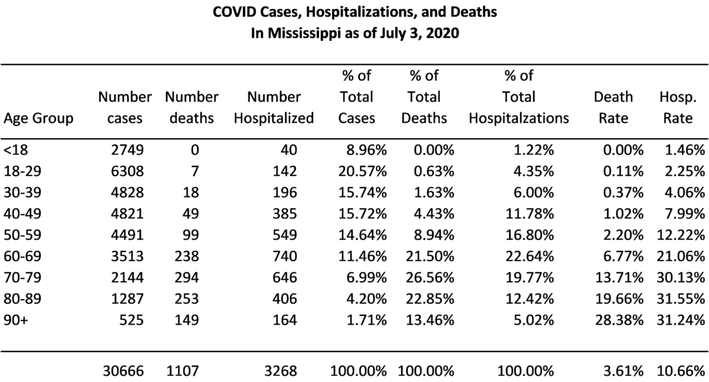
Second, with regard to deaths, we see that age plays a very large role. From the table below, nearly 85% of all deaths were persons 60 years of age or older. The incidence of deaths relative to the number of cases increases with each increase in age.
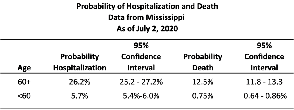
Taking this a step further, treating this as a sample of data, we can create a database to simulate the Mississippi data as reported and estimate probabilities of deaths and hospitalization with respect to age in the general population. Because we do not have the individual data, only totals, we create an artificial dataset to replicate the distributions as in the data.
In doing so, the estimates show that the predicted probability of hospitalization from COVID for a person under 60 is 5.7% compared to a person 60 years of age or older of 26.2%. With respect to deaths, the predicted probability is less than 1% (.75%) for persons under 60 years of age, and 12.5% for persons 60 years of age or older.
Below are the estimates and ranges within the 95% confidence intervals.
Conclusion
Hopefully, the above provides some helpful hints as to understanding and interpreting data.
The main point intended to be conveyed is the importance of having a broad view and applying appropriate context. This is critical in determining what type of analysis is the most meaningful as well as being better positioned to draw conclusions. Once such a basic, overall understanding is achieved, and it is determined what question(s) are to be answered, it is then appropriate to focus on the smaller aspects.
To close with an example, one issue often encountered in statistical work is observers having a limited understanding of underlying principles. One may interpret statistical results based merely on the existence of “statistical significance”, for example, and overlook critical context, such as sample sizes, magnitude of measured differences, or the limitations of data itself. Such a myopic view can lead not only to misinterpretation but also inappropriate application of certain analyses. A “one-size fits all” approach is not only limiting, but can also produce misleading conclusions.
The famous quote popularized by Mark Twain about lies and statistics is more often found to be true when facts are omitted rather than when facts are considered. Ensuring context and having a big picture perspective will enhance both accuracy and comprehension.
There are three kinds of lies: lies, damned lies, and statistics. – Author Unknown
How to cite this blog post (APA Style):
Premier Insights. (2020, July 9). Making Sense of COVID-19 Numbers: 5 Keys to Data Interpretation [Blog post]. Retrieved from https://www.premierinsights.com/blog/making-sense-of-covid-19-numbers-5-keys-to-data-interpretation.